CASE FILE // NILE-PHARMA
Nile Pharma Food
01 / CONTEXT & AUDIT
THE PROBLEM & STAKES
A pharmaceutical and health-supplements manufacturer operating without brand governance or visual standards. Packaging was fragmented across outside printers, marketing materials were improvised, and products struggled for shelf presence in major pharmacy chains against imported brands.
- DISCIPLINE
- Systemic Identity
- TEAM SCALE
- Brand Lead (Mustafa) · Sales Director · Regulatory Affairs · Print Vendors
- TIMELINE
- 2020 → 2025 · identity from zero, then full rebrand
- RECORD
- NILE-PHARMA
AUDIENCE & MARKET CONTEXT
Consumers purchasing everyday nutritional supplements (Proxeed Plus, Proxerex), community pharmacists dispensing healthcare products (e.g. El Ezaby Pharmacy), physicians, and national pharmaceutical distributors.
EXACT ROLE & COLLABORATION
Official role: Media Director & Account Manager (Mustafa Aboalazm, 2020–2025). Functional scope included brand direction, identity redesign, packaging architecture, marketing campaign systems, and digital web presence. Collaborated closely with the Sales Director, Regulatory Pharmacist, and print production houses.
02 / RESEARCH & LOGIC
GUIDING CONCEPT & METAPHOR
Pharmaceutical Rigor + Food Supplement Vitality — anchoring the identity in corporate stability ('Nile Navy') combined with the active freshness of dietary health. Embodied by 'The Blue Box' packaging architecture and a bespoke geometric bilingual wordmark.
REJECTED DIRECTIONS & RATIONALE
1) Cliché green leaf & water droplet symbols: Rejected because the company produces regulated pharmaceutical-grade formulations, not raw herbal teas. 2) High-vibrancy electric cyan (#00C8D2): Rejected in packaging press proofs because it compromised the clinical seriousness required on pharmacy shelves.
Working positioning hypothesis: the brand needed to balance pharmaceutical credibility with the warmth and accessibility expected of food-supplement products. The chosen direction joined both needs in one visual system. The accompanying map is illustrative, not a named-competitor audit.
03 / EXECUTION & GOVERNANCE
The system, governed: tokens, states, and the grid they live on.
STRUCTURAL TOKENS
Approved vs Rejectednile-navy | #1B2A5BLOCKED | Approved Primary · Corporate Heritage & Trust |
wave-blue | #39A0D6LOCKED | Approved Secondary · Product Packaging & Hydration |
life-green | #37A66BLOCKED | Approved Accent · Nutrition & Herbal Supplement Line |
pure-white | #FFFFFFLOCKED | Approved Canvas · Clean packaging readability |
alt-cyan | #00C8D2 (Rejected)REJECTED | Rejected in testing: neon tone reduced clinical trust |
cairo-font | BoldLOCKED | Approved Bilingual Display & Arabic Hierarchy |
COMPONENT STATES
RESPONSIVE LAYOUT
DRAG THE LINE — AUDIT STATE ⇄ GOVERNED SYSTEM
WHERE THE SYSTEM LIVES — PRODUCTION DEPLOYMENT
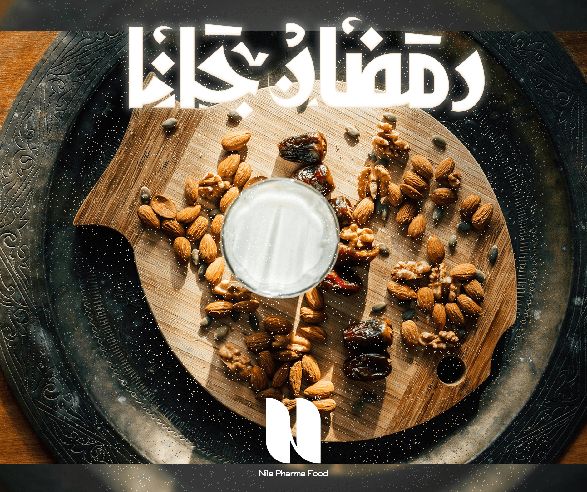
Distributed across pharmacy retail channels across Egypt, primary product carton boxes (Proxeed line), highway outdoor billboards, medical presentation flyers, official website, and bilingual Ramadan & seasonal campaigns.
DESIGN PROOF — ORIGINAL & LEGIBLE ARTIFACTS
Logo Construction, Scale Verification & Production Applications

Logo Geometric Construction Grid
Bilingual wordmark engineered on a strict geometric modular grid ensuring identical optical balance in Arabic and English.
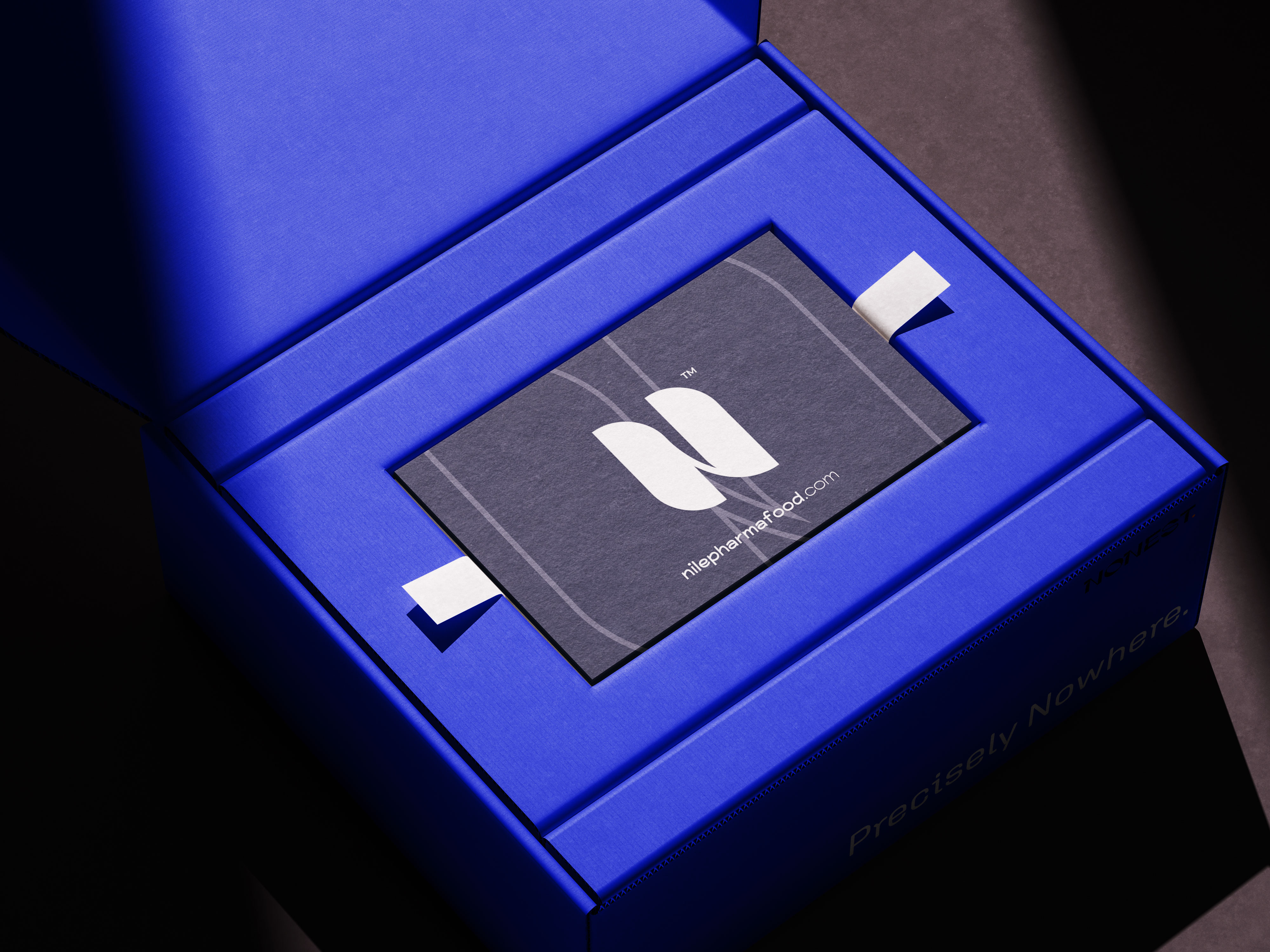
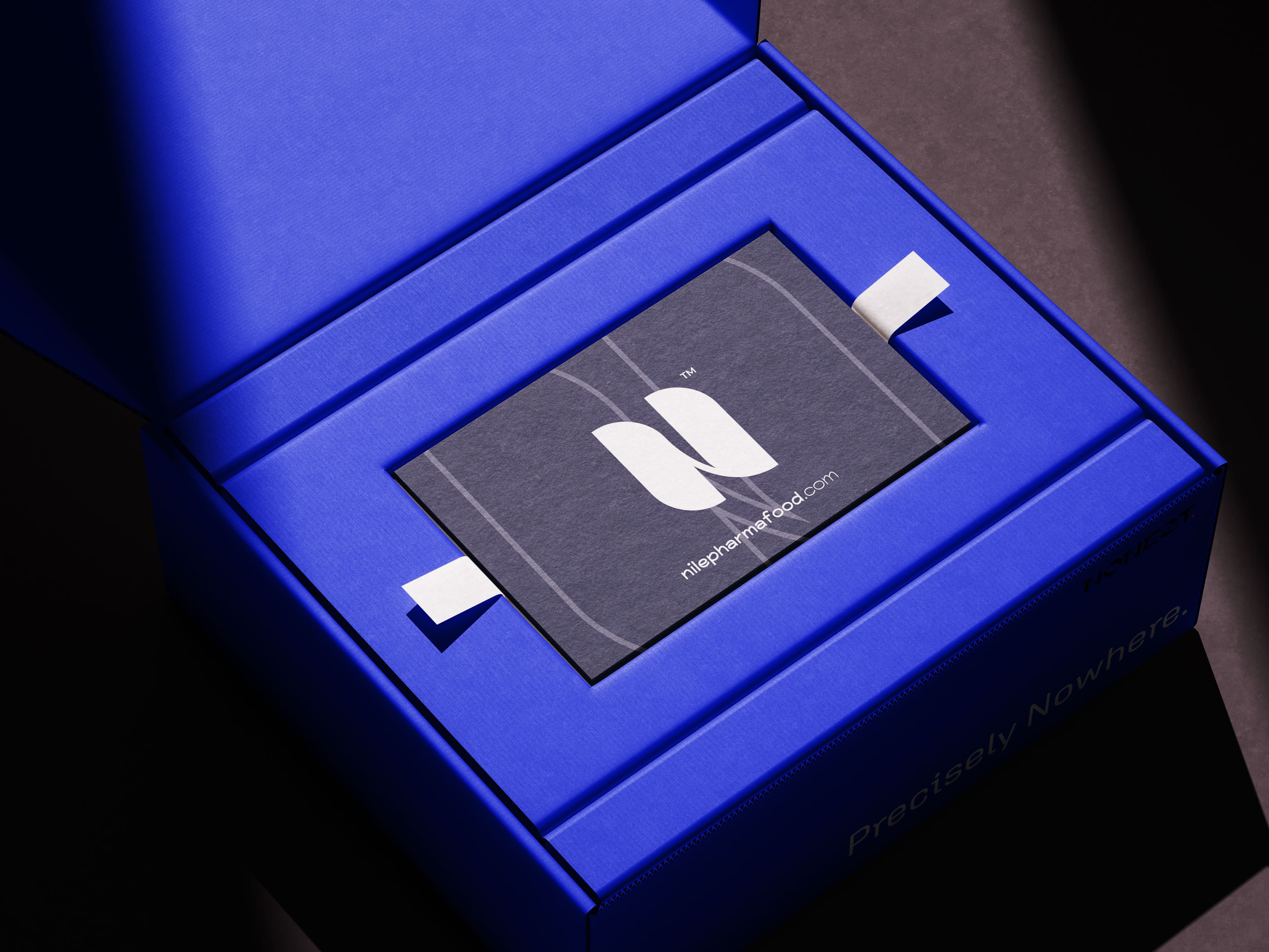
Consumer Packaging — 'The Blue Box'
Rigid pharmaceutical box architecture pairing deep navy authority with clear product differentiation for the pharmacy shelf.
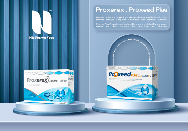
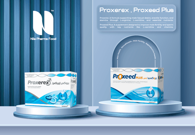
Product Line Packaging (Proxeed Plus & Proxerex)
Standardized carton packaging layout maintaining regulatory clarity, bilingual dosing instructions, and high shelf impact.
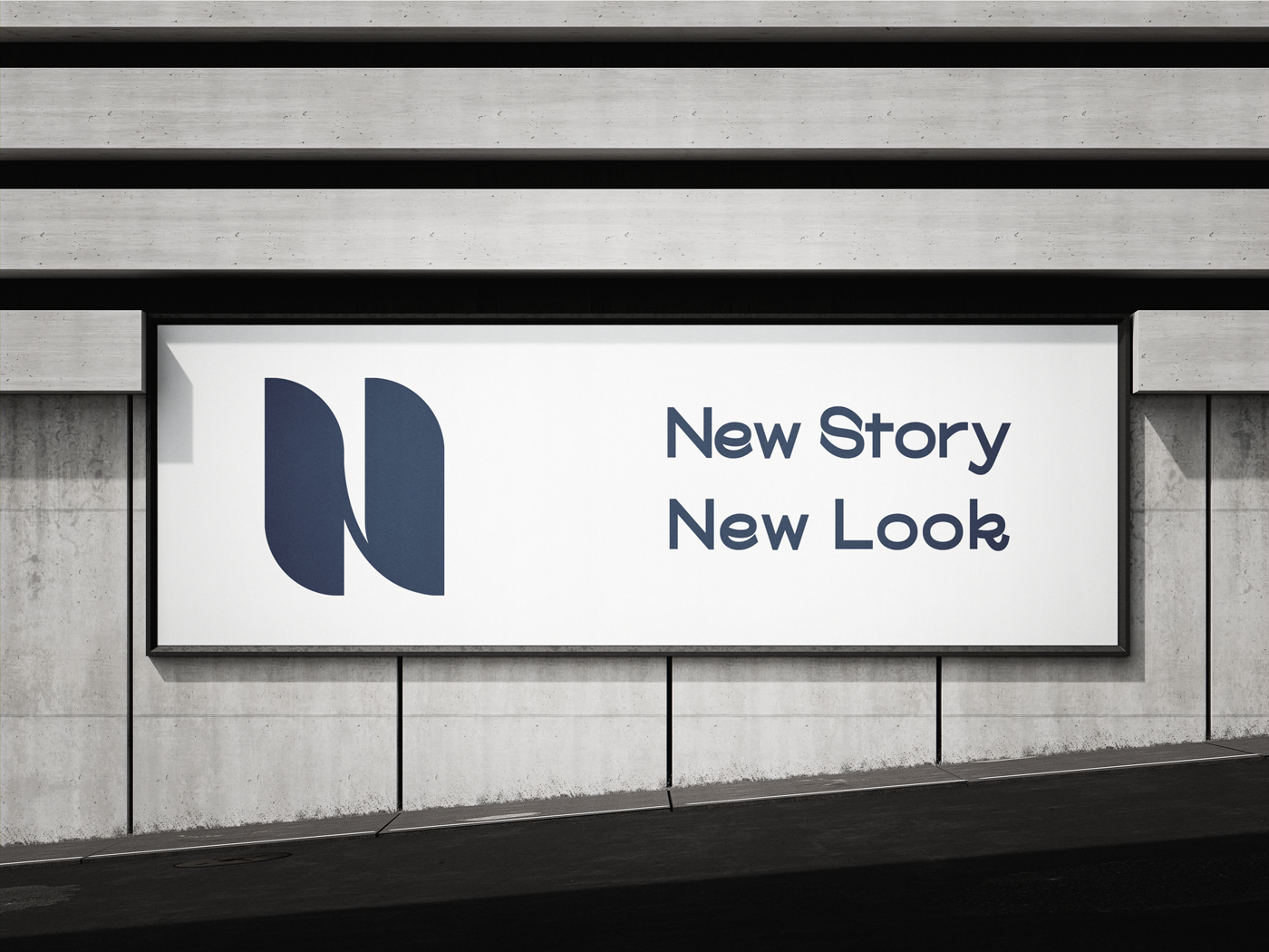
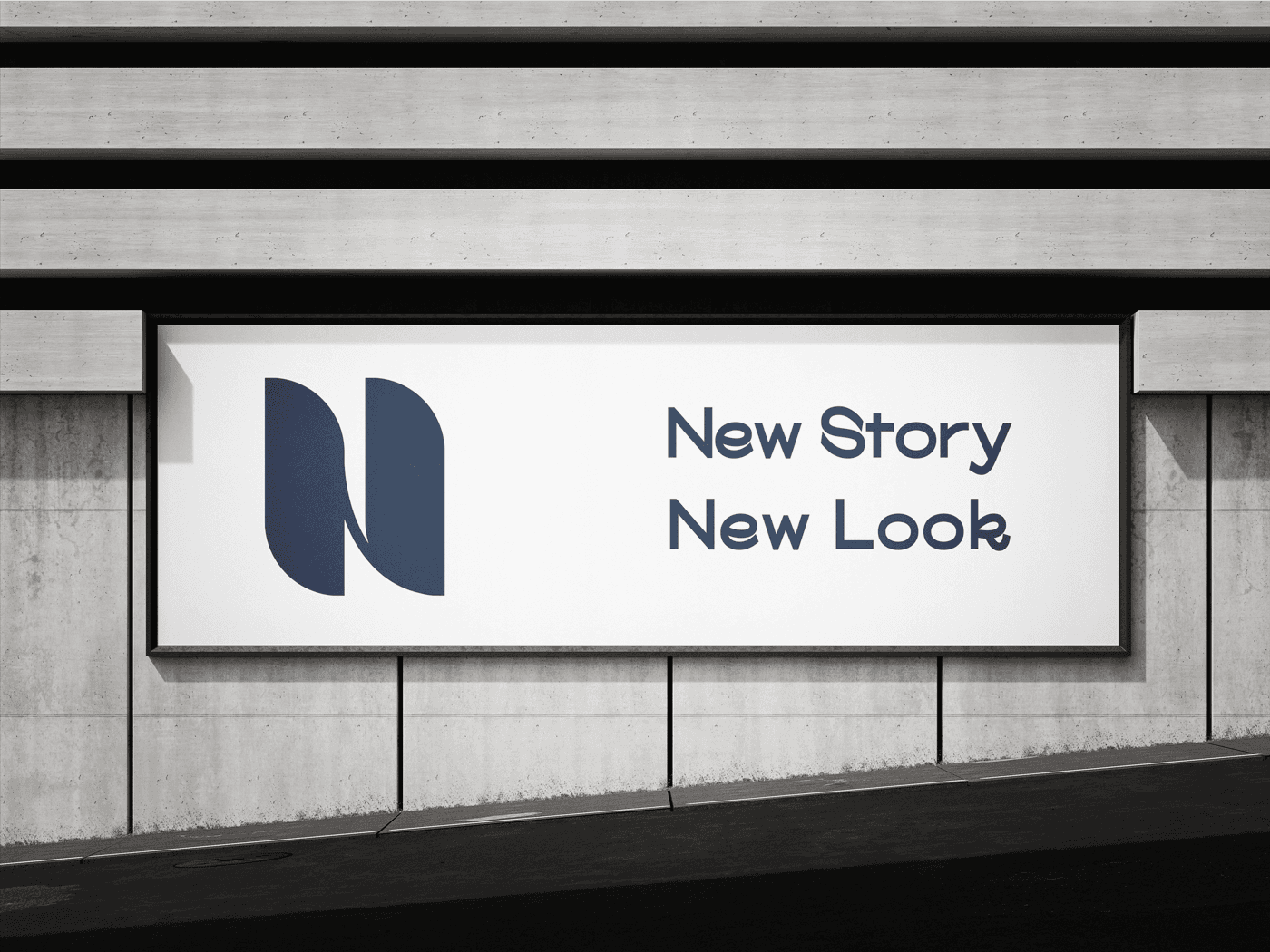
Outdoor Billboard & Campaign Advertising
Large-scale highway advertising translating the brand voice ('We Care About You') with immediate high-speed legibility.
DELIVERABLES — SYSTEM IN PRODUCTION
Logo construction grid

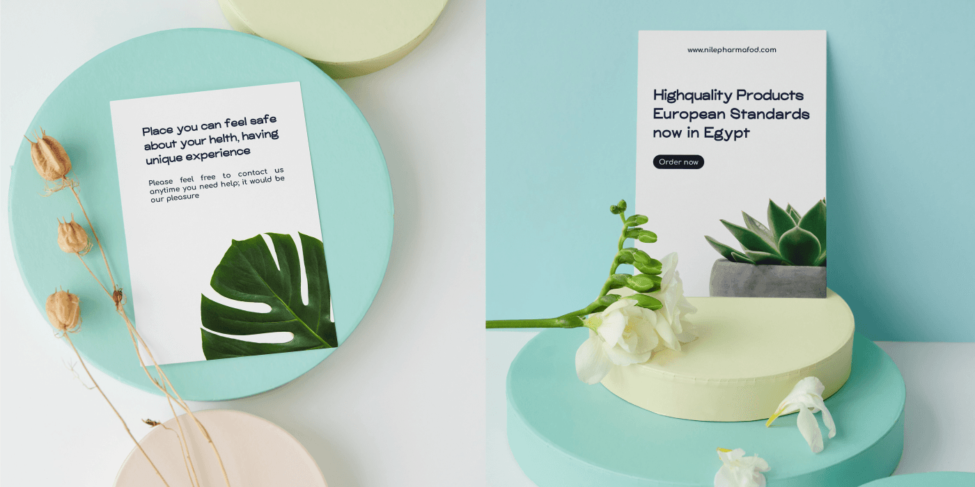
Identity on palm leaves
Business card & packaging
Proxeed Plus & Proxerex
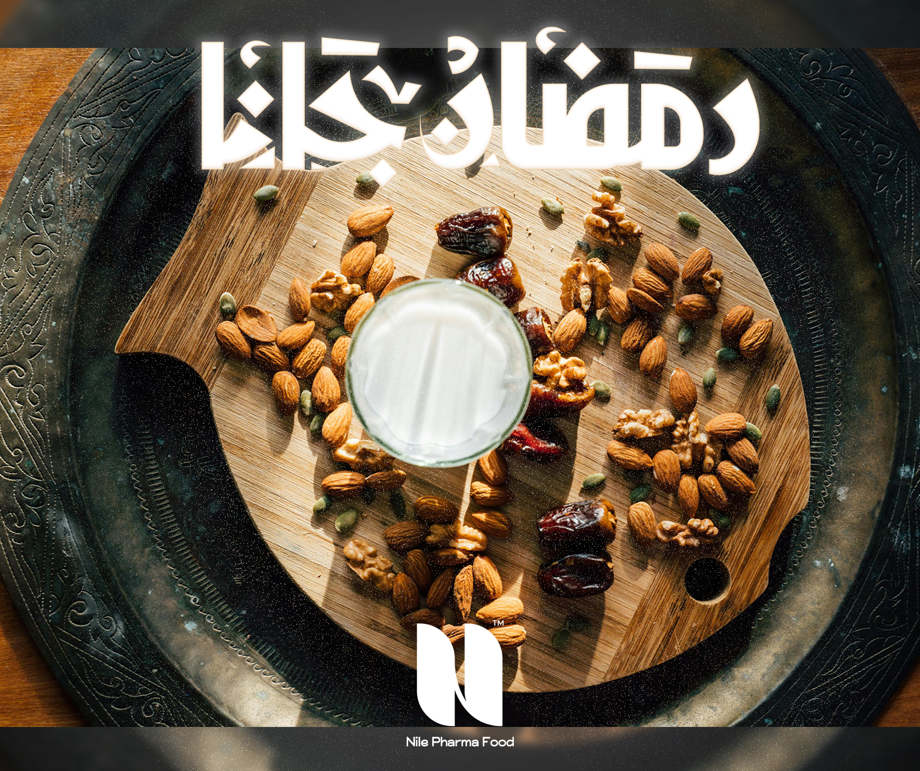
Ramadan campaign post

Proxeed — campaign
Billboard — New Story
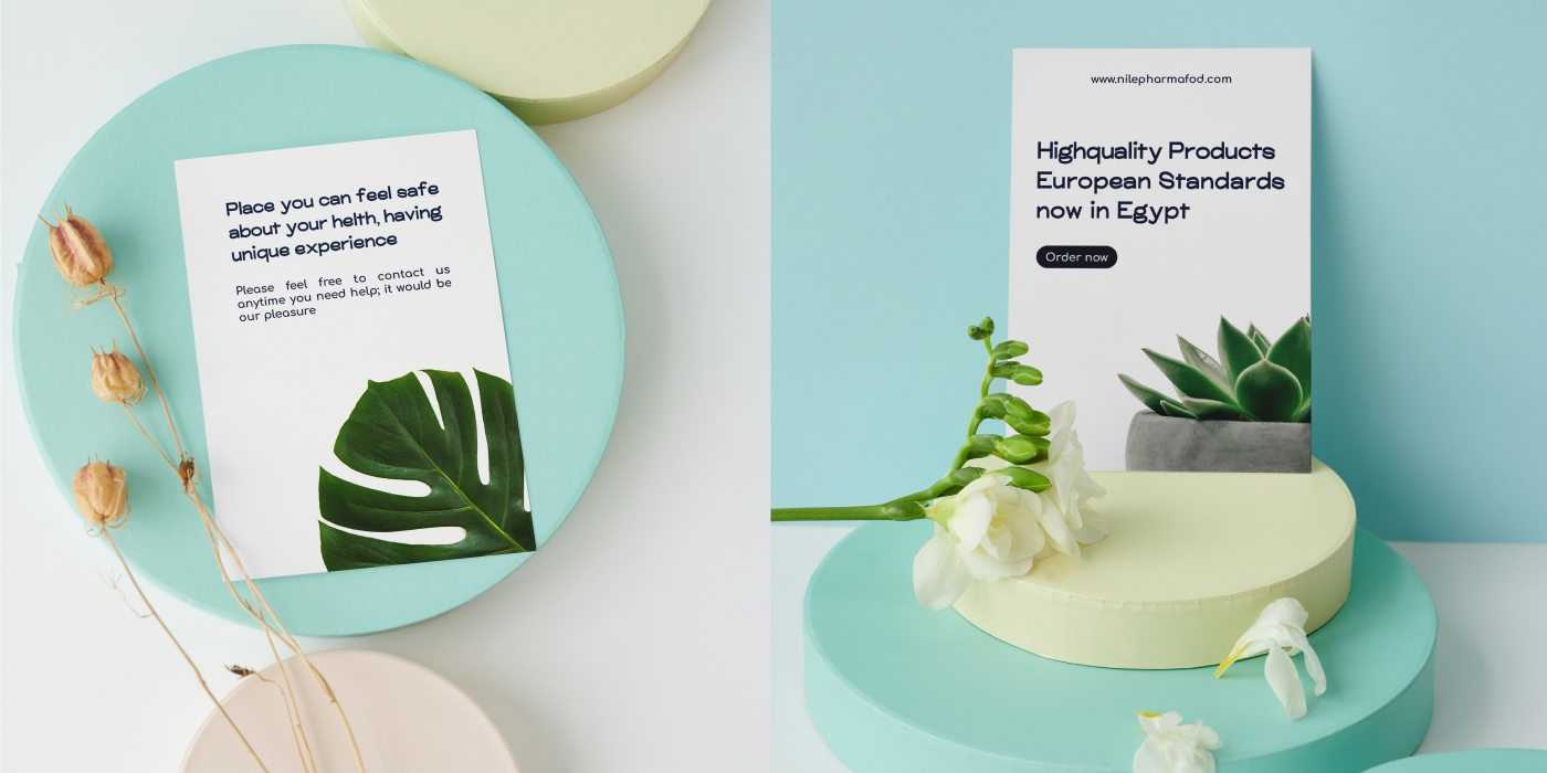
Product flyers

We care about you

Ezaby — social post

Logo motion study
GALLERY / THE SYSTEM, RENDERED





04 / PERFORMANCE & POST MORTEM
RETRO LEDGER