CASE FILE // GAD-INSTITUTE
GAD Heart & Lungs Institute
01 / CONTEXT & AUDIT
THE PROBLEM & STAKES
A specialized cardiac and pulmonary care institute operating under generic, cold hospital branding — with no mark reflecting its dual life-saving specialization, no visual governance across patient communications, and an urgent need to compete with internationally branded regional health groups.
- DISCIPLINE
- Systemic Identity
- TEAM SCALE
- Creative lead (Mustafa) · medical director · marketing manager
- TIMELINE
- 2023 · Complete brand system, end to end
- RECORD
- GAD-INSTITUTE
AUDIENCE & MARKET CONTEXT
High-anxiety cardiac and pulmonary patients, their families seeking trusted reassurance, patients and families in the Eastern Province and regional private health insurers. In healthcare, visual inconsistency translates directly to perceived clinical risk.
EXACT ROLE & COLLABORATION
Sole Brand Identity Designer & Creative Lead (Mustafa Aboalazm). Designed the full system: brand strategy, bilingual symbol, typography system, Pantone palette, brand book (V2.0), and architectural signage specs. Collaborated with the Medical Director (anatomical accuracy) and Marketing Manager.
02 / RESEARCH & LOGIC
GUIDING CONCEPT & METAPHOR
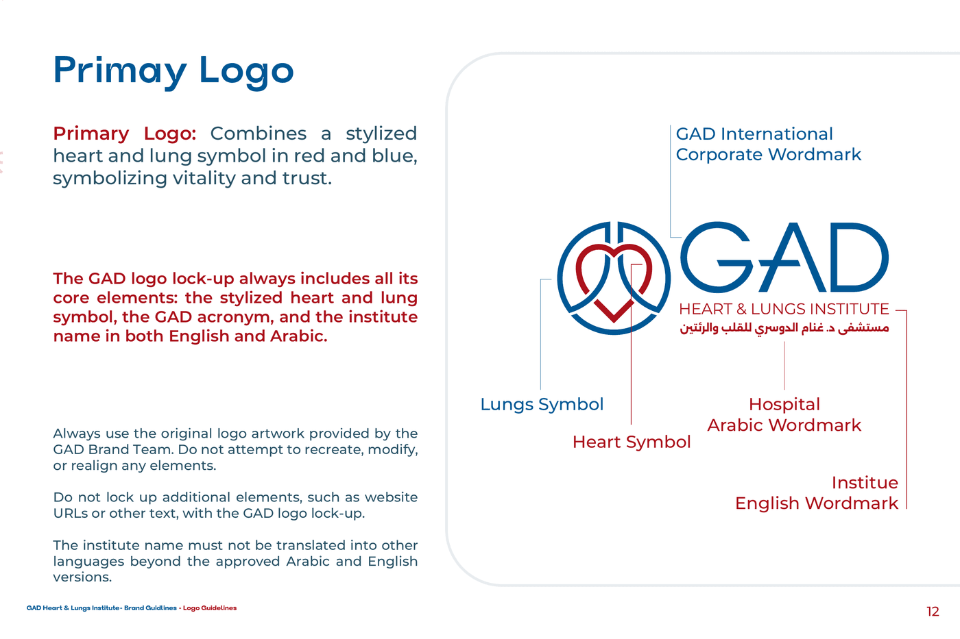
The Trusted Specialist ('Closer to Every Heart') — fusing anatomical heart and lung geometry into a continuous circular seal. The gesture combines circulatory vitality and pulmonary breath in one precise, human mark.
REJECTED DIRECTIONS & RATIONALE
1) Generic medical cross and stethoscope tropes: Rejected because they commoditize the brand and fail to establish distinct trademark equity. 2) High-saturation neon cyan (#3A86FF): Rejected during discovery for feeling like consumer software rather than clinical authority.
Healthcare identity in Egypt clustered into two poles: clinical-corporate (cold, bureaucratic) or consumer-pharma (loud, promotional). GAD needed a third voice — the trusted specialist: warmer than a hospital, more precise than a clinic, internationally legible without losing Egyptian rootedness.
03 / EXECUTION & GOVERNANCE
The system, governed: tokens, states, and the grid they live on.
STRUCTURAL TOKENS
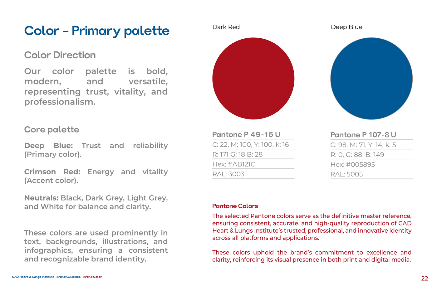
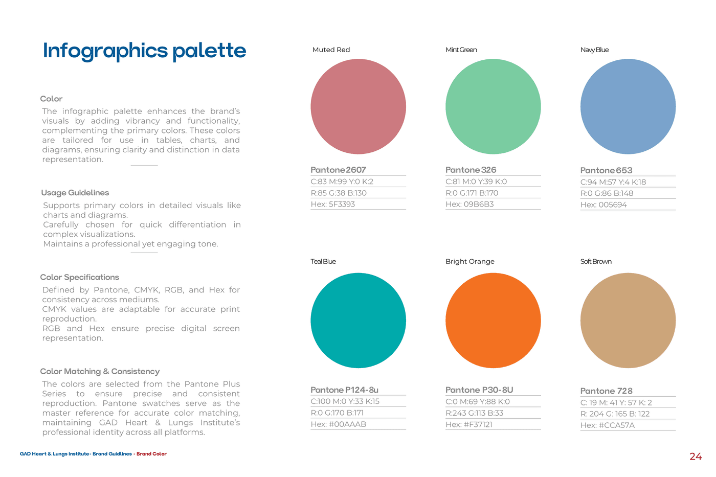
Approved vs Rejecteddeep-blue | #005895LOCKED | Trust / primary · P 107-8U |
crimson-red | #AB121CLOCKED | Vitality / accent · P 49-16U |
cool-grey-8 | #888B8DLOCKED | Neutral / dark grey |
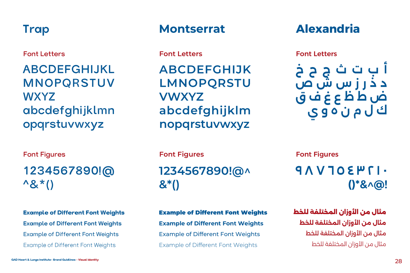
Trap | BoldLOCKED | Bold headlines / titles |
Montserrat | RegularLOCKED | Body / subheads |
Alexandria | RegularLOCKED | Arabic titles + body |
COMPONENT STATES
RESPONSIVE LAYOUT
DRAG THE LINE — AUDIT STATE ⇄ GOVERNED SYSTEM
WHERE THE SYSTEM LIVES — PRODUCTION DEPLOYMENT
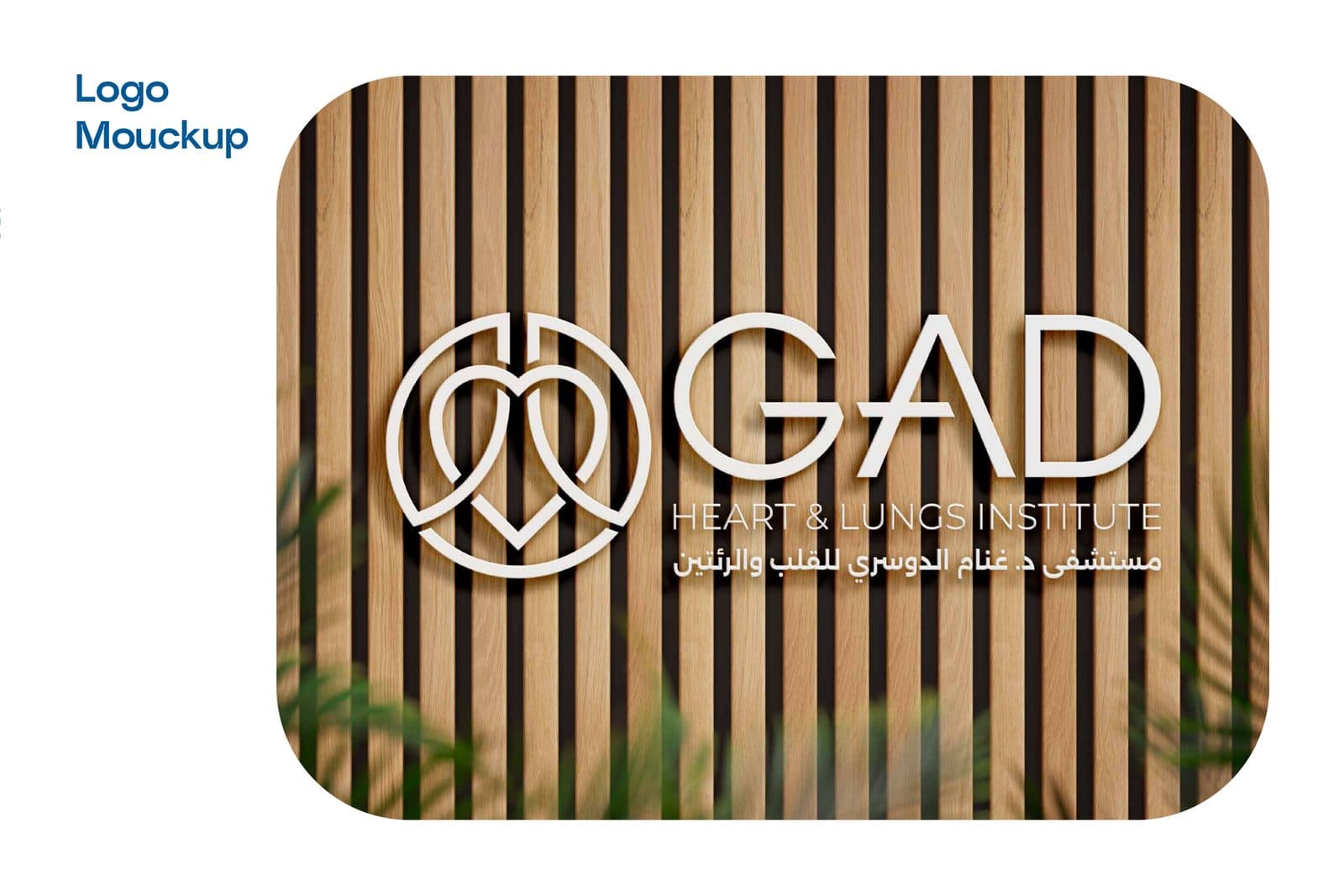
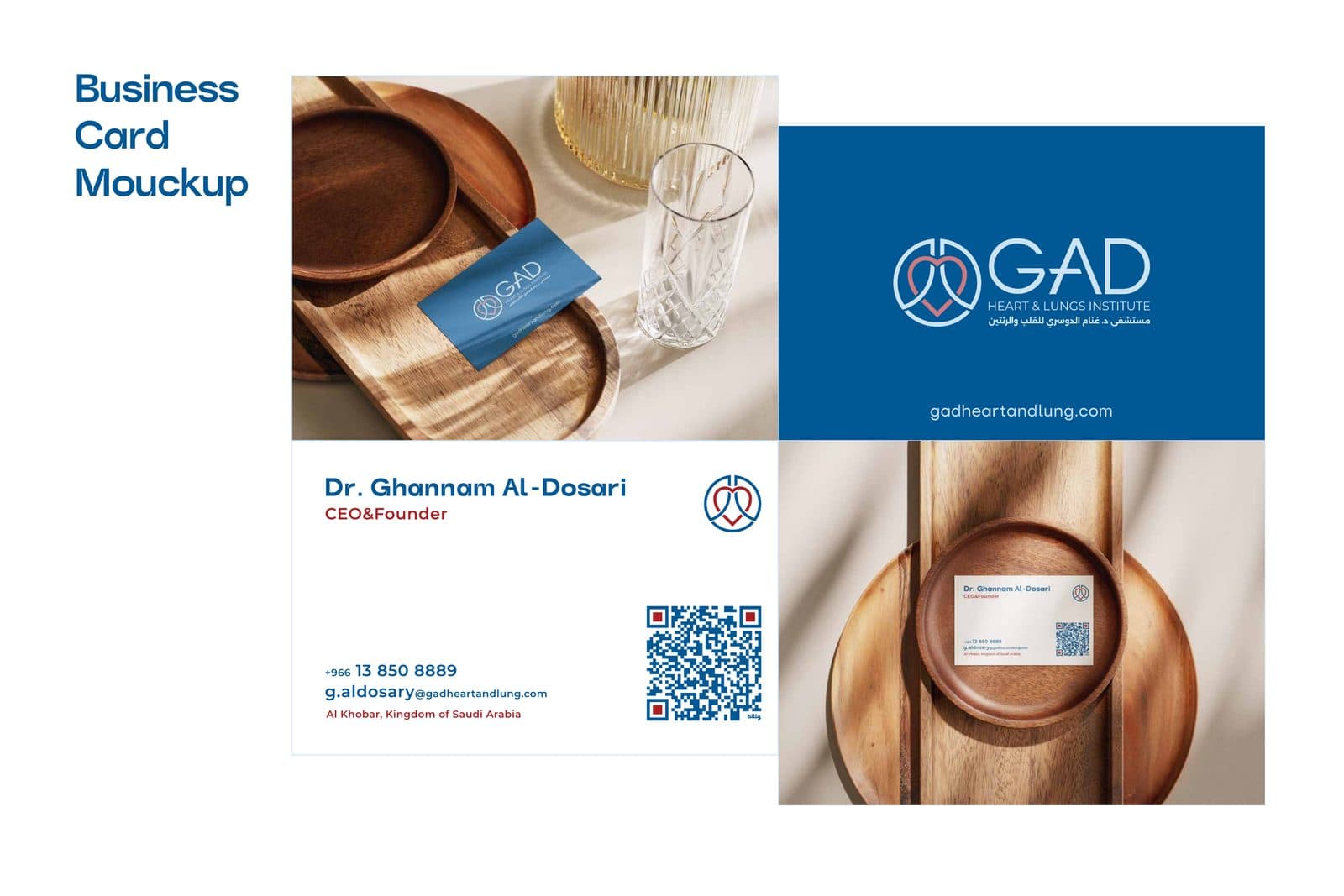
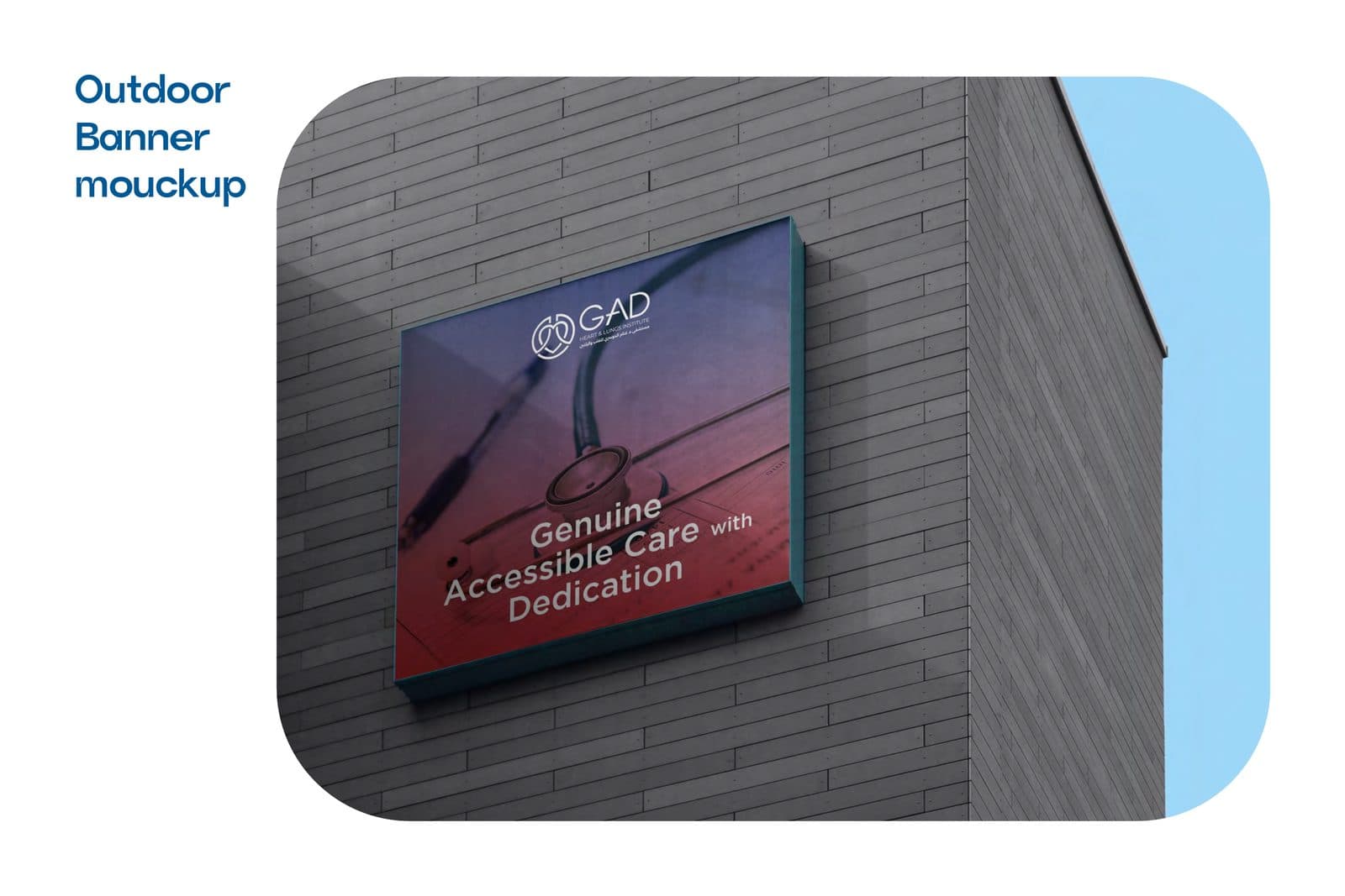
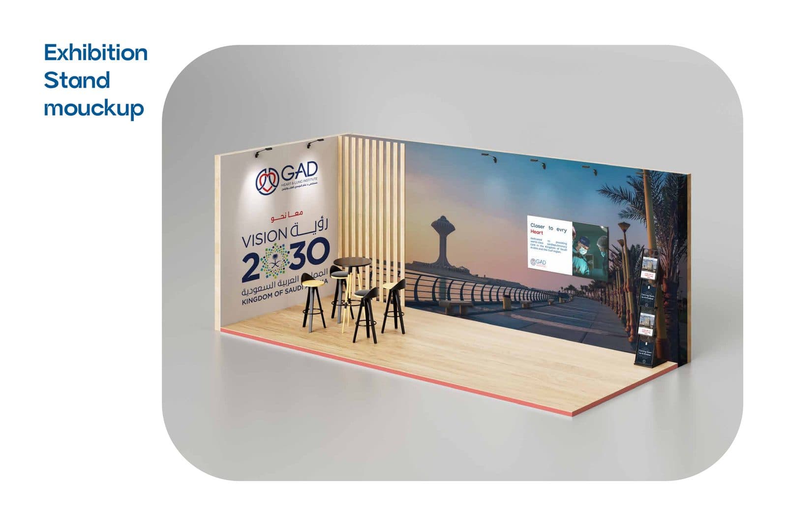
Main hospital facade signage, 3D reception wall seals, internal patient wayfinding, staff uniforms, bilingual diagnosis folders, prescription stationery, digital presence, and healthcare summit exhibition stands (Vision 2030).
DESIGN PROOF — ORIGINAL & LEGIBLE ARTIFACTS
Logo Construction, Scale Verification & Production Applications
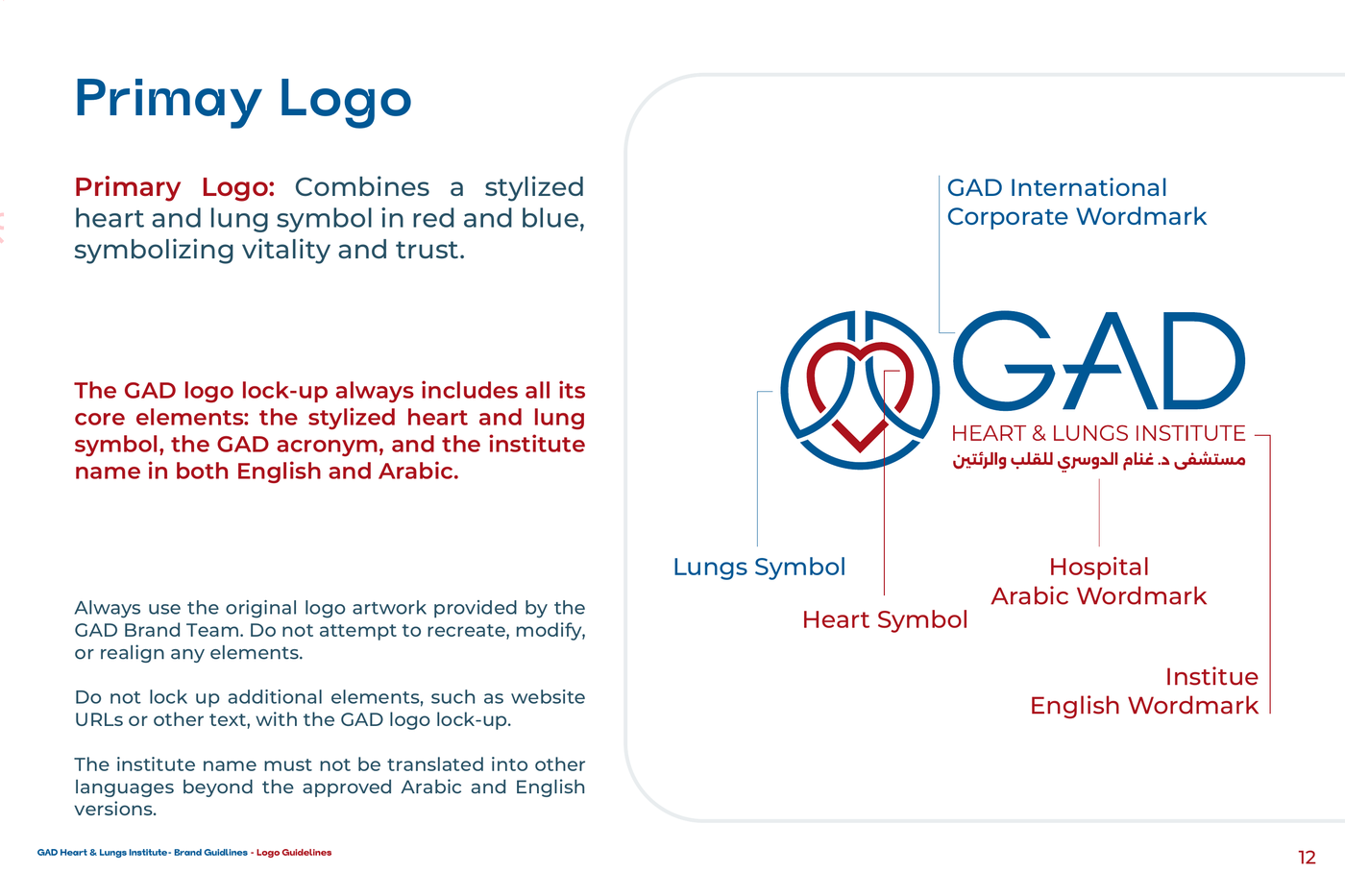
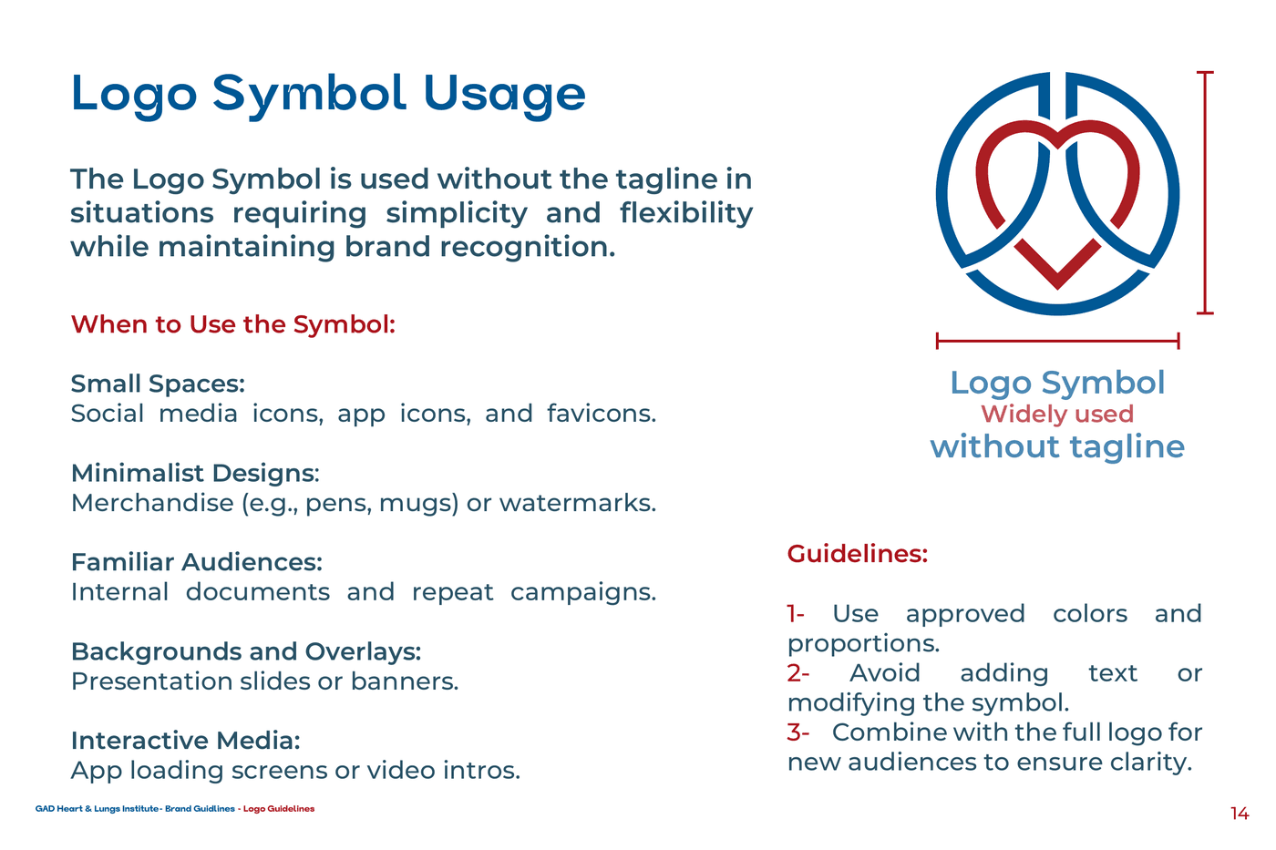
Logo Anatomy & Geometric Construction
Mathematical alignment of heart and lung chambers inside a continuous golden-ratio curve.
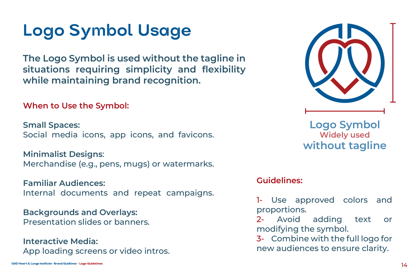
Scale & Favicon Legibility Test
Tested from 16px digital favicon to multi-meter exterior building signage without stroke collapse.
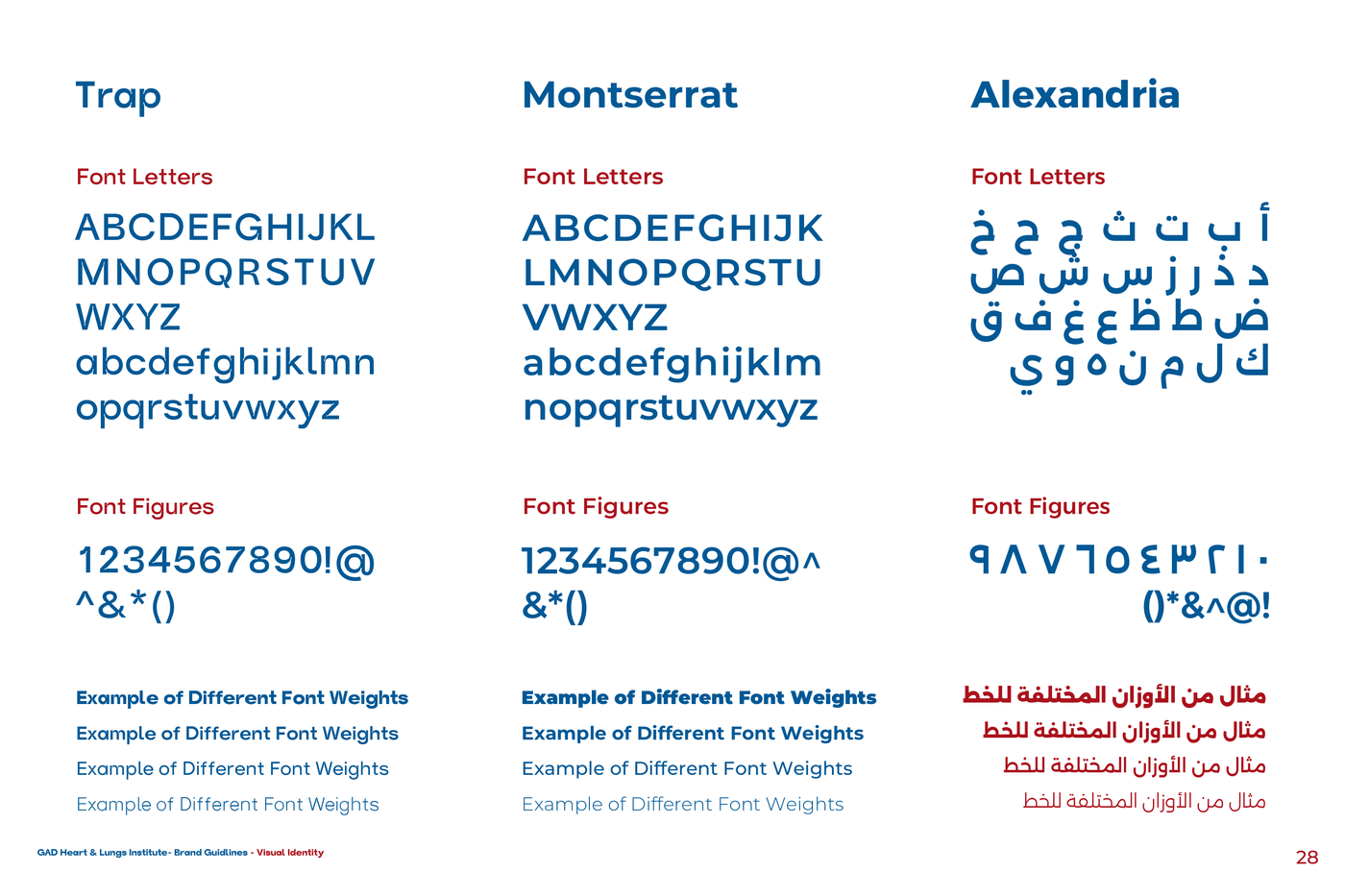
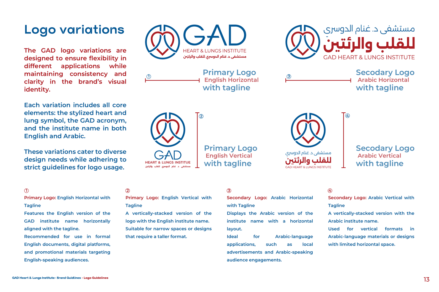
Bilingual Typography Pairing
Trap (Bold Display) paired with Alexandria (Arabic Title & Body) for structural optical parity.
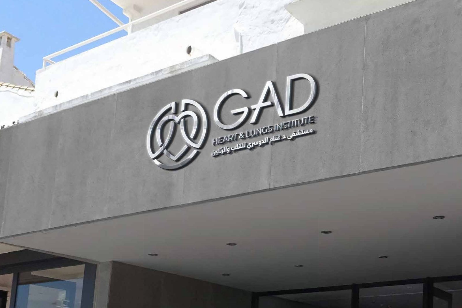
Environmental & Architectural Signage
Physical exterior facade signage fabricated with exact Pantone 107-8 U Deep Blue specs.
GALLERY / THE SYSTEM, RENDERED
04 / PERFORMANCE & POST MORTEM
RETRO LEDGER